All About Choosing the Perfect Color Palette For Your Concrete Decor!
Share

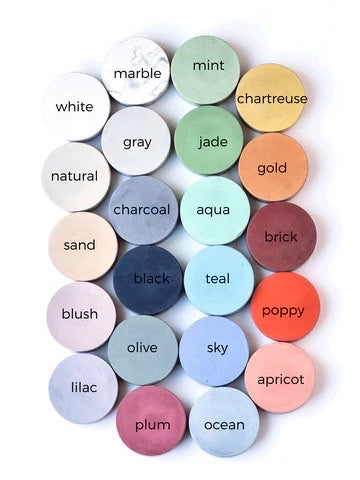
When it comes to interior design, the color scheme is a key component in creating the ambiance of your space. Concrete décor, known for its versatility and durability, offers a unique opportunity to incorporate a wide range of colors into your office, bath, or home. Whether you're looking for a sleek, modern look or a warm, cozy atmosphere, the right color palette can help you achieve your design goals. Here's how to choose the perfect colors for your concrete décor pieces, using a variety of shades we offer.
1. Understand the Mood You Want to Create
Office:
For a productive and focused environment, consider neutral tones like charcoal, gray, and white. These colors promote concentration and minimize distractions. Adding accents of marble or black can create a sophisticated, professional look.
Bath:
A bathroom should feel refreshing and clean. Opt for colors like mint, aqua, ocean, and sky for a spa-like atmosphere. For a more luxurious feel, incorporate marble, gold, or plum.
Home:
Your living space should reflect your personality and lifestyle. Warm colors like apricot, poppy, and brick can make a space feel inviting and fun, while cooler tones like jade, plum, and lilac add a touch of elegance and serenity.
2. Consider the Existing Décor
Look at the colors already present in your space. If you have a lot of warm wood tones, consider adding sand, olive, or chartreuse concrete pieces to complement them. For more modern spaces with metal or glass, black, charcoal, and gray can tie everything together.
3. Think About the Function of the Space
High-Traffic Areas: For areas that see a lot of activity, like entryways or kitchens, durable colors like charcoal, black, and natural are neutral and ideal.
Relaxation Zones: Spaces meant for relaxation, like bedrooms or reading nooks, benefit from softer colors like blush, lilac, and plum. These tones create a calming atmosphere perfect for unwinding.
4. Embrace Accent Colors
Don't be afraid to introduce bold accent colors like poppy, teal, or chartreuse. These can be used sparingly to create visual interest and draw attention to key areas or pieces within your space.
5. Balance and Harmony
When choosing multiple colors, consider the balance between them. A good rule of thumb is to follow the 60-30-10 rule: 60% of your space should be a dominant color, 30% a secondary color, and 10% an accent color. For example, in a bathroom, you might choose marble as the dominant color, mint as the secondary color, and gold as the accent.
6. Consider Lighting
The way light interacts with your concrete décor pieces can affect how the colors appear. Natural light can make colors like ocean and sky feel more vibrant, while artificial light might enhance the warmth of apricot or poppy. Test your chosen colors in different lighting conditions before making a final decision.
7. Experiment with Finishes
Black or marble finishings can add a touch of luxury to your space, while a calmer natural or sand finish can offer a more rustic feel. Consider how the finish interacts with your chosen colors to enhance the overall aesthetic.
8. Earthy Tones
When selecting colors, consider ocean, lilac, sand, and olive to not only enhance your space but also
Conclusion
Choosing the right color palette for your concrete décor is a balance of personal preference, functional needs, and aesthetic goals. By considering the mood, existing décor, function, and lighting, you can create a cohesive and beautiful space. Whether you're drawn to the timeless elegance of marble and charcoal or the playful vibrancy of poppy and teal, the perfect colors are out there waiting to transform your office, bath, or home.
For more inspiration on concrete décor and how to integrate these beautiful pieces into your space, view our collections!


